Cannastride
When recreational marijuana became legal in California, newly established CA dispensaries now needed a way to connect with local growers. Two pot-friendly entrepreneurs out of the Bay Area realized that there were no major players filling this roll. They jumped on the opportunity, formed Cannastride and were able to obtain one of only three available licenses to distribute in the state.
Objective
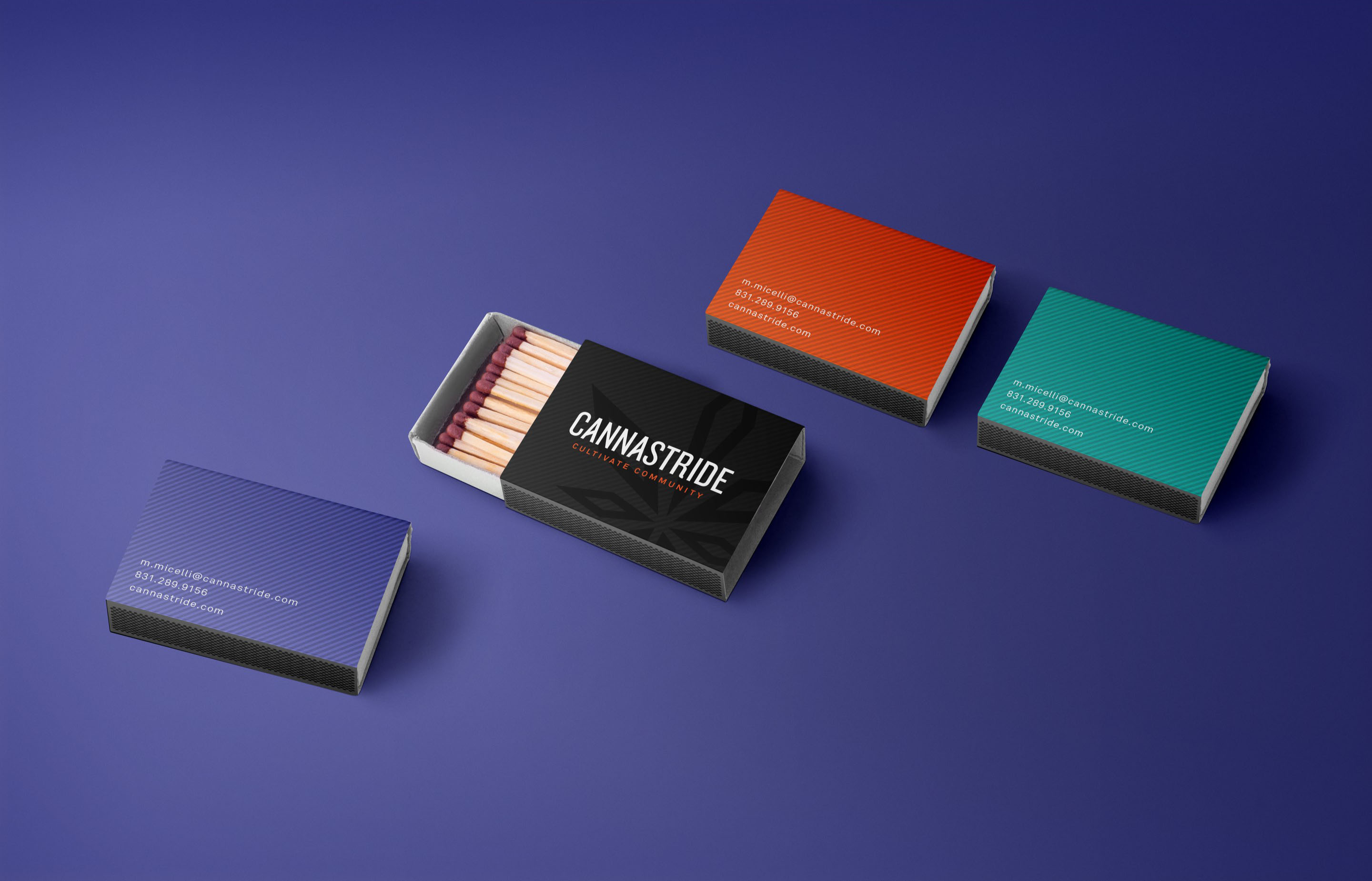
Design a brand identity and packaging solution for Cannastride that growers could utilize if they didn’t have on-the-shelf packaging of their own. The final logo incorporates a simplified geometric pot leaf that points outwards in all directions symbolizing organized dispersement. The new visual style utilizes an extended color palette of bright, poppy colors that resembles the graffiti scene and lifestyle of the Bay Area and Los Angeles where most of Cannastride’s clientele is based.
Scope
- Brand Positioning
- Brand Strategy
- Logo Design
- Packaging
- Visual Identity